Explore higher ed across the country here.
In much of the existing higher education literature, “college access” is understood in terms of pre-college educational attainment, social and informational networks, and financial capacity, both for tuition and living expenses. The US ranks highly on initial college access by comparison with other countries, but this access—along with all major metrics of college success, including completion rates, default rates, and debt-to-income ratios—exhibits drastic inequality along familiar lines of race, gender, class, and geography.
Along with other pernicious myths, the media stereotype of the college student often figures undergraduates traveling far from home to live in a dorm on a leafy campus. In reality, over 50% of students enrolled in four-year public college do so close to their home. This means that the geography of higher ed institutions strongly determines the options available to a given student. While a large share of higher education policy discourse justly attempts to improve students’ access to information (on school costs, financial aid information, completion rates, or post-graduation employment statistics, and the like) to inform their school choices, political attention to geographic access remains sparse.
Previous research on the geography of higher ed has simply reported the number of institutions in a given area. But the raw number of schools is ambiguous, as it fails to account for enrollment. We wanted to complicate the picture: given the uneven distribution of higher ed institutions and institution types—public and private non-profits, as well as for-profits of all kinds—around the country, we wanted to examine what role market concentration might play in a higher education industry increasingly characterized by a wide divide between elite institutions and the landscape of what Tressie McMillan Cottom has termed “Lower Ed.” Starting from the perspective that many students are not going to travel long distances to be in residence full-time at a leafy campus, how many options are they realistically looking at? And what’s the relationship between concentration, disparities on the basis of race, class, and geography, institutions’ resulting market power, and college cost, debt loads, and post-graduate earnings?
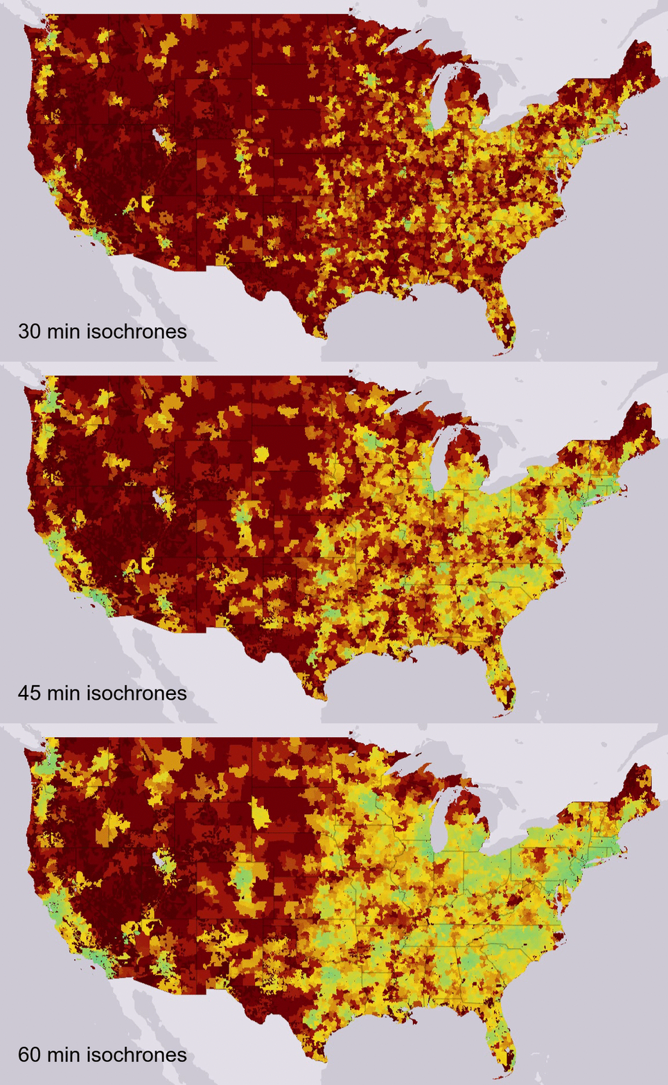
As a first step in examining market power in the higher education industry, in collaboration with Francis Tseng, we made a mapping tool that displays our new measure of local enrollment concentration. Building from the literature on market concentration, we’ve developed the School Concentration Index (sci)—the first of its kind—to measure variation in the higher education market across different school types, and across the United States and the US territories. We measure concentration for areas defined by driving distances of 30, 45, and 60 minutes. (The analysis in this post is based on the 45 minute driving distance.) For a full description of the sci, expand the section below.
More on our school concentration index
Our school concentration index (sci)—the first of its kind—uses 12 month enrollment numbers from IPEDS and driving distance isochrones from OpenStreetMap. By creating scis for every zip code tabulation area (zctas are areal representations of ZIP codes; we use ‘zip’ here for ease of reading) in the United States and US territories, across different school types, we can see greater variation in higher education competition than ever before.
Every zcta has a unique School Concentration Index where $n$ number of schools in each sci equals the amount of schools where it is possible to drive to the associated zcta within 30, 45, or 60 minutes, depending on the selected map view. Each $s_n$ is the undergraduate enrollment share of a school within the geographic area, expressed as a whole number rather than a fraction.
Our formula for the sci is based on the formula used in the Herfindahl-Hirshman Index (hhi), which calculates market concentration using market shares for companies within a given market, typically defined in geographic and sectoral terms. Similarly, the sci uses enrollment shares for schools of a given type in a given geographic area. Our scale is identical to the hhi as well—ranging from 0 (perfectly unconcentrated) to 10,000 (complete monopoly), and a zip without a sci indicates an education desert—no schools nearby. We compute the size of the geographic area—the size of the higher education market—by using driving time without traffic as a measure of distance, with 45 minutes serving as our default. (On our interactive map, you can toggle driving distances to view the results of analysis for 30, 45, and 60 minute driving distances.)
A sci of 0 indicates that every school in the particular zip’s geographic reach accounts for an extremely small fraction of the total enrollment (i.e. no concentration present); a sci of 10,000 indicates that the zip has only one school within geographic reach, which accounts for the entirety of the zip’s available enrollment (i.e. extremely concentrated).
As you can see on the map, concentration ranges widely across the country—from extremely concentrated in rural areas (when in some cases there aren’t any institutions at all), to areas like New York City, dense with higher ed institutions of all kinds. Extreme concentration is concerning for myriad reasons but primarily because it means the school could determine prices and access unilaterally and possibly practice price discrimination. Some states limit tuition increases on public colleges, while others tried but failed to enact these types of bills—of course, at private schools, nothing much outside antitrust investigations (which have occurred in the past) can be done. It’s also important to note that even though having only one school nearby means a monopoly on the market, these institutions are vital resources for a community’s economy. (This first post is reckoning with concentration in higher education supply. We’ll dive into antitrust, cost, and debt later in the series.)
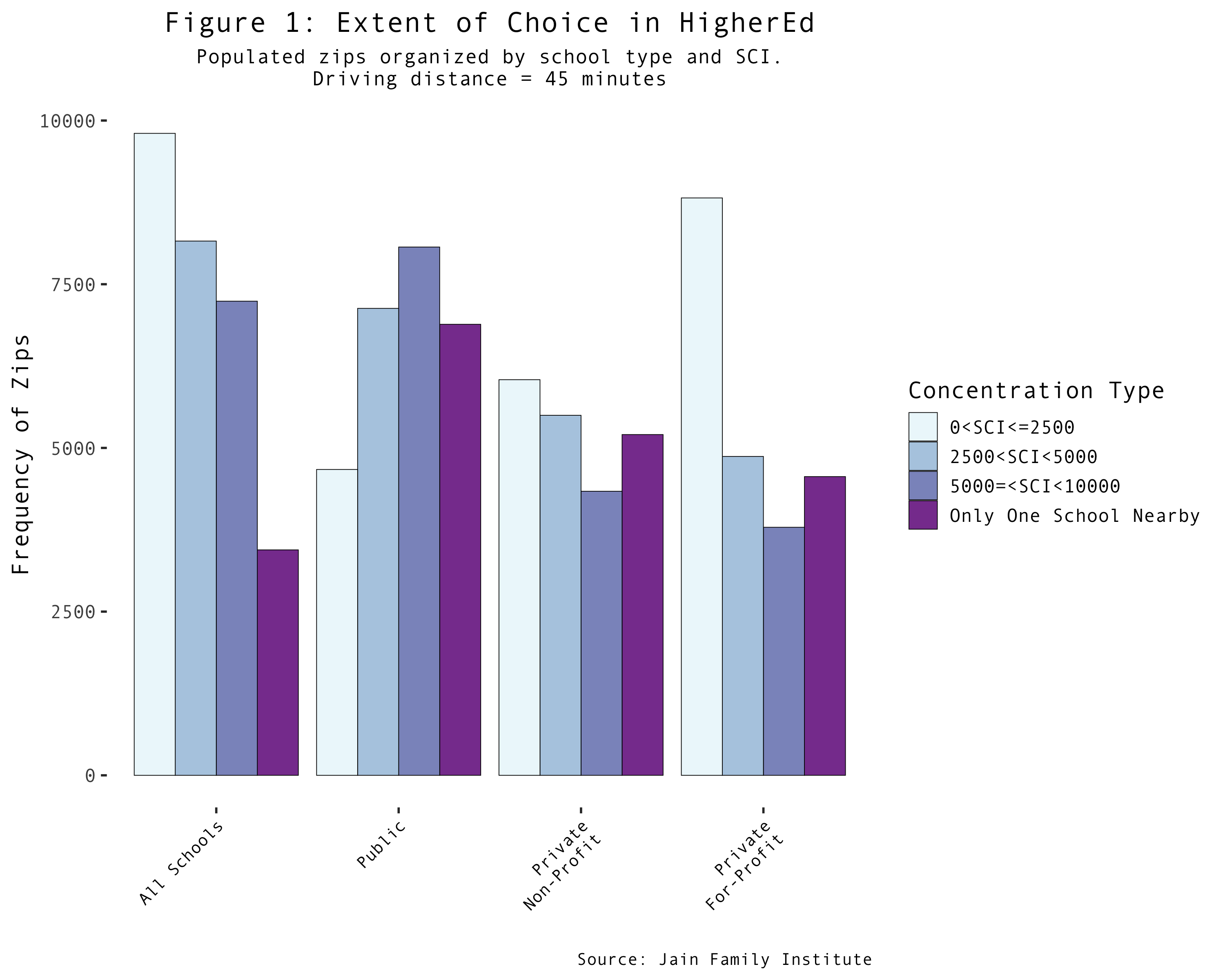
There are a vast number of zips with a concentration index of 10,000 (only one school nearby). Just as concerning are the number of zips that lack an index altogether—these are known as education deserts. (For more on these regions, see the work of Nicholas Hillman here.) In 2016, across the states and territories, 5.4 million individuals lived in education deserts, lacking access to any type of higher education institution. If we narrow our analysis to public schools, the statistics get worse; 10.1 million individuals live in public education deserts and 30.7 million individuals have access to only one public school. This means over 40.8 million people in the United States and US territories have access to at most one public higher education institution nearby.
In October 2016, 19.1 million people—roughly 5.93% of the US population—were in some type of postsecondary school.1 Applying this same statistic to our 40.8 million individuals who lack public choice, we arrive at a staggering 2.4 million higher ed bound individuals being subjected to an extremely concentrated public higher education market (sci = 10,000 or education desert). These numbers become far worse when we shorten our driving distance to 30 minutes, or switch to examining the private not-for-profit or private for-profit markets.
| People Affected | |||||
|---|---|---|---|---|---|
| School Type | SCI ≤ 2500 | 2500 < SCI < 5000 | 5000 ≤ SCI < 10000 | Only 1 School Nearby | Education Desert |
| All Schools | 197.1M | 74.3M | 36.3M | 8.8M | 5.4M |
| Public | 120.6M | 98.1M | 62.3M | 30.7M | 10.1M |
| Private Non-Profit | 133.6M | 79.6M | 38.3M | 28.3M | 42.0M |
| Private For-Profit | 183.1M | 59.1M | 32.9M | 19.3M | 27.4M |
The DOJ and FTC use similar indices to measure market concentration in all types of markets. According to their benchmarks, a highly concentrated market scores above 2500 on the scale. By this measure, over 38% of the US population lives in highly concentrated higher ed zips, accounting for all types of schools (if we use 30 minute commutes, this number jumps to over 58% of the US population). Furthermore, 45 of the 56 states and territories in our analysis have a median all-school sci above the 2500 threshold even after we eliminate education deserts from the analysis altogether. Of the ten states and territories with the lowest ratio of total enrollment to population, four of them are US territories, three of which only have one school available to residents. If we exclude outlying territories, the Rocky Mountain region is the worst off, followed closely by the Plains region. The region wide average sci of these two areas are 6347.51 and 6216.49. Compare that to the average sci of New England (3591.28) and the Mideast (2980.50), and use the number lines below to compare the concentration and enrollment of any state.
State-by-state comparisons across all school types
Our map allows us to identify several other relationships. Disparities in concentration between rural and urban areas, for example, are immediately apparent, and worsen as we reduce the driving distance. Selecting data by school type reveals even more nuanced findings: regions which have little to no access to public institutions see a higher number of for-profits. Research looking at higher ed in the years after the financial crisis, when ‘retraining’ was the watchword of the day, has demonstrated the demand-responsiveness of private for-profits. Here, we see that dynamic play out along geographic lines: places that lack access to traditional higher education, and in particular public higher education, are prime hunting ground for for-profit institutions, just as they are known to draw disproportionately from populations historically excluded from traditional higher ed on the basis of race and class.
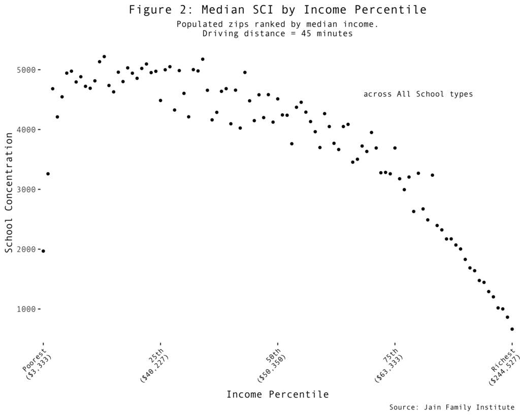
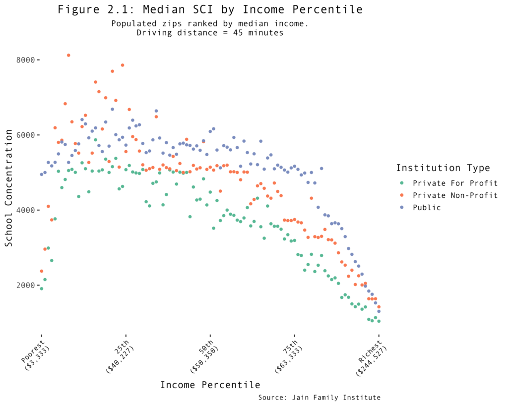
What’s driving the concentration variation? After looking at the regional disparities, population density is the first clear possibility. This seems to hold some explanatory power at the state level, where the correlation between population and enrollment was 0.98. However, the relationship weakens as we shift to the zip level, reaching 0.49. How about income? When we look at the overall picture, there’s only modest positive correlation between enrollment and median income at the zip level (0.31), which all but disappears at the state level (0.02). If we look instead at the relationship between concentration level and median income by zip code, the relationship persists: -0.31 at the zip level and -0.28 at the state level. As median income increases, we therefore see a moderate decrease in school concentration. Since both variables are right-skewed, we investigated how the relationship operates along income percentiles; is there concentration inequality? When we placed every zip into its appropriate US-wide median income percentile, a stronger pattern emerged: the richest zips experience far less school concentration than their poorer counterparts. The fact that concentration not only falls with rising income, but decreases especially sharply for the highest percentiles, is indicative of systemic inequality in higher education supply across all school types.
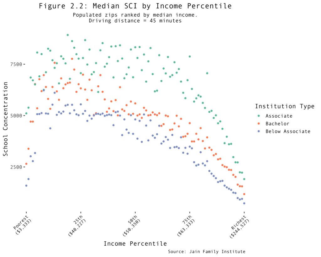
These disparities are drawn out further when we subdivide institutions by type, either in terms of public/private and nonprofit/forprofit, as well as degrees offered. Public institutions tend to be bigger, so the markets where they exist tend to be more concentrated. For-profits tend to be smaller and therefore exhibit less concentration in the markets where they predominate. But below-associate degrees are the least concentrated degree type, which reflects professional certificate programs offered in large part by for-profits. Lower levels of concentration indicate the degree to which such institutions are taking advantage of the gaps left by the traditional higher ed sector.
Our concentration index enables policy researchers to measure the potential effects of geographic concentration on higher ed prices, debt levels, the labor market and other policy areas where competition may be particularly relevant to student outcomes. It broadens our understanding of “access,” and introduces some nuances into debates on college quality and affordability.
Most directly, the index indicates that tuition-free public universities alone cannot resolve inequalities in access across the country—indeed, rather than “choking out” for-profits, the distribution of public colleges and universities appears to create markets for them in areas without a proximate public option. Thus, it is crucial that any initiative to make public college tuition-free must not just reify existing inequalities on the basis of geography or any other dimension encoded in the existing geography of American higher education. Stark geographic disparities call for reconsidering and reassessing the demand and supply forces that are at play in the higher education market.
This is the first publication within a series examining the effects of higher education concentration. Using a one-million person repeated cross-sectional dataset, subsequent maps and posts will begin to examine the relationship between concentration and net costs, levels of indebtedness, the relationship between student and other forms of consumer indebtedness, disparate effects by race, income levels by age cohort, and others. In the meantime, explore the map here, and get in touch with any questions and feedback.
To get all future Phenomenal World posts directly in your inbox, sign up here.
-
US Census Bureau. School Enrollment in the United States: October 2016 – Table 5. “Type of College and Year Enrolled for College Students 15 Years Old and Over, by Age, Sex, Race, Attendance Status, Control of School, and Enrollment Status: October 2016.” Published August 23, 2017. ↩
Filed Under